Inspirations and news in e-commerce
22 February 2016, Igor FarafonowThis time we took a close look at the international e-commerce market 🙂
In 2015 the value of e-commerce market in Poland surpassed 30 billion PLN, which means the increase of around 3 billion PLN in the last year. It’s an enormous market share, even if for example the British and American e-commerce markets aim at much larger sums. Polish e-commerce market is dominated by the standard schemes which are mostly copied because “if they are working” why should they be changed into something new? This is why we decided to do a little research online. We checked some typical international online stores and product pages with shopping functionalities and we came up with a list of engaging and innovative solutions.
Check them out 🙂
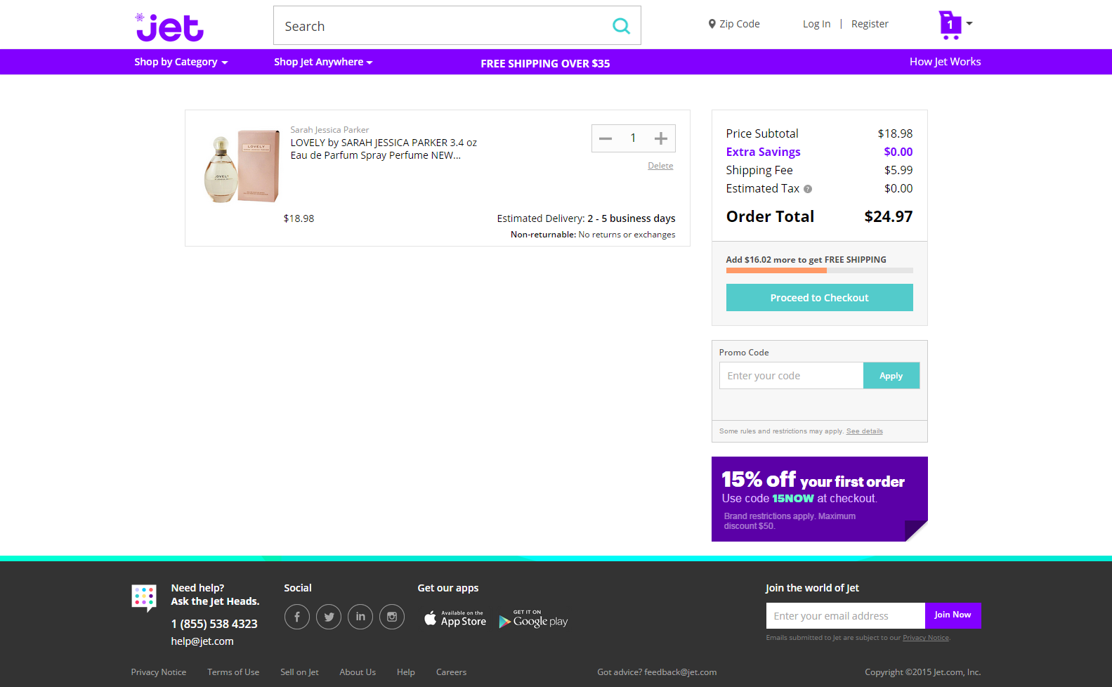
Jet
- At Jet.com we noticed a functionality which graphically shows us how much we’re short from getting a free shipping (status bar on the right)
- Besides that, the entire philosophy of the store is really clever – the more you spend, the bigger is your discount 🙂
Shoebuy
- Very often stores block user’s ability to add a product to the cart if the user doesn’t configure the product – e.g. specify the size of clothes. Shoebuy enables adding a product to the cart without defining its size. You can provide the size later on at the shopping cart screen.
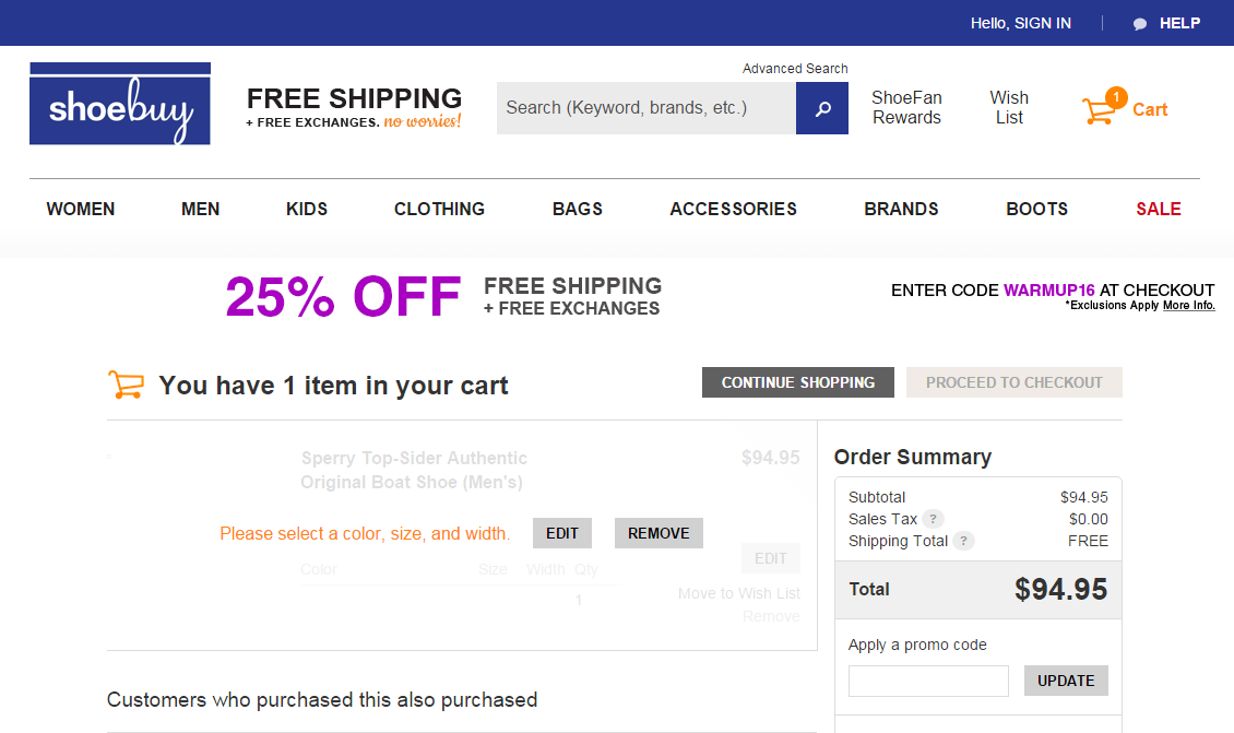
https://www.shoebuy.com/cart/cart
Drugstore
- Automatic reorder – very useful functionality that can be applied to the “recurring” products like dietary products, supplements.
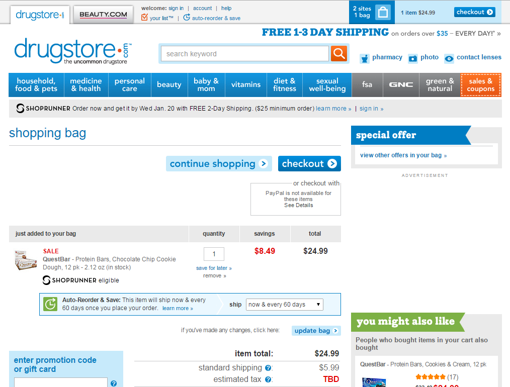
http://www.drugstore.com/shoppingbag.asp?catid=17008&productlist=,485358
Ao
- Very refreshing way of having a dialogue with users – creators of the site came up with three questions which help users to find products they are looking for. These are: type of product (it’s worth to mention that the choice of categories is very limited to the most popular items), feature 1 and feature 2.
- When users are specifying what they are looking for they answer two simple questions which increase the chance of finding the desirable product.
- It’s also worth to mention the limit on presented subcategories – we don’t need an entire category branch within the dialogue. It can be based on 10/20 most frequent subcategories.
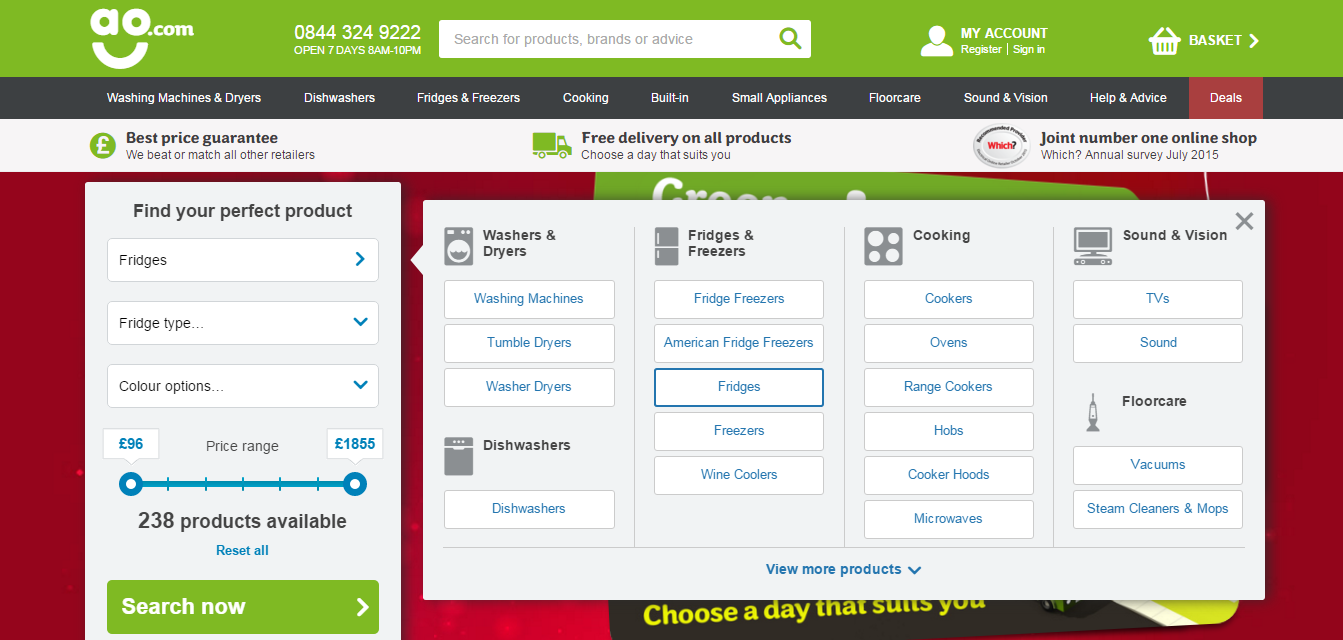
- Useful detail – after scrolling down the product tab, the inner navigation of the product gets fixed in the upper part of the screen. It’s a great solution because the interface of the store is adjusted to the exact area of user’s action.
http://ao.com/product/bdc643w-beko-electric-cooker-white-23696-11.aspx
- One of the most engaging solutions that we noticed as a part of the benchmark was the QA tab enabling users to ask questions about the product. On the one hand, it substitutes one of the most important reasons of going offline – possibility to ask for more details. On the other hand, users can also read through questions that were already asked by others.
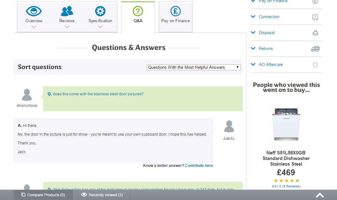
http://ao.com/product/ltf11m132c-hotpoint-ultima-standard-dishwasher-stainless-steel-27901-23.aspx
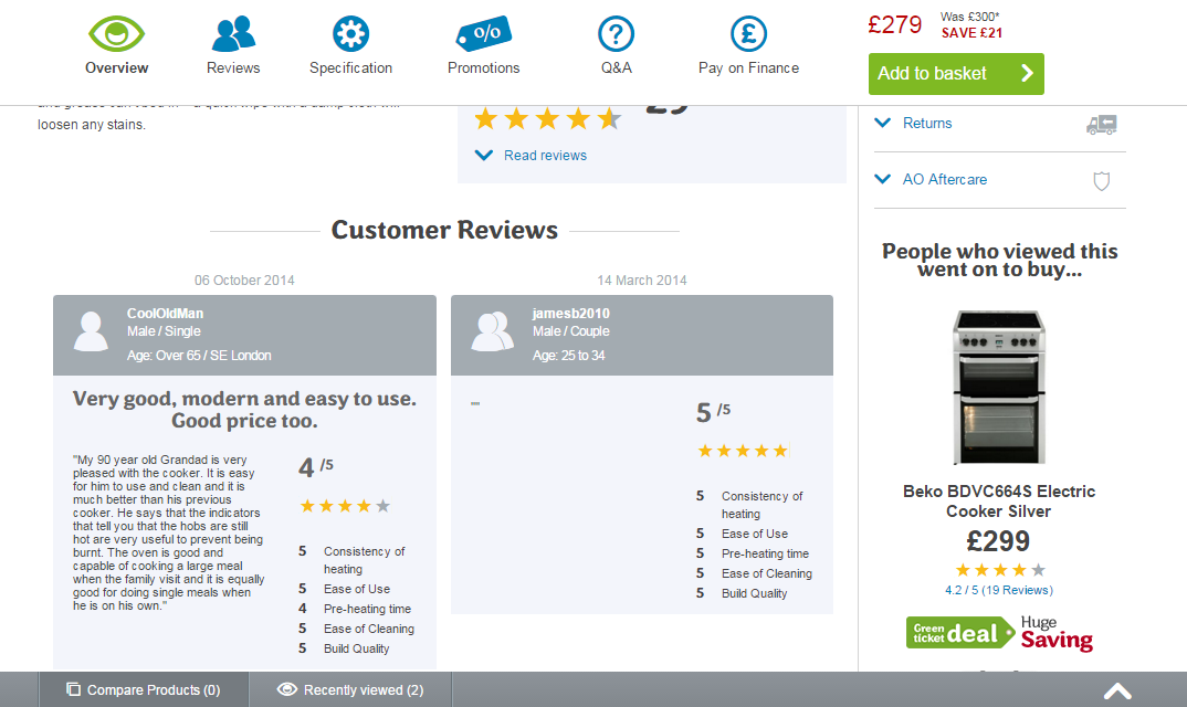
- In case of stores which offer a wide range of products, it’s great to add personalised elements to the scoring system for each category. For this store it could be e.g. build quality, quietness, effectiveness, etc.
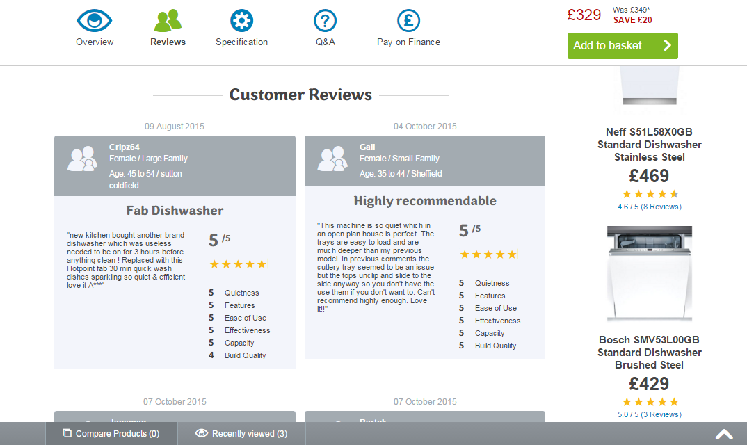
http://ao.com/product/ltf11m132c-hotpoint-ultima-standard-dishwasher-stainless-steel-27901-23.aspx
ETQ
- If it comes to fashion stores the key element would be presenting beautiful, high resolution photos. All information (besides the basics) are secondary. This was used by ETQ – while scrolling through product tabs we go through gorgeous photos. At the right we have a fixed (not scrolled) module with basic information about the product. Of course everything has pros and cons. For example here the call to action button placed at the bottom of the page can be overlooked.
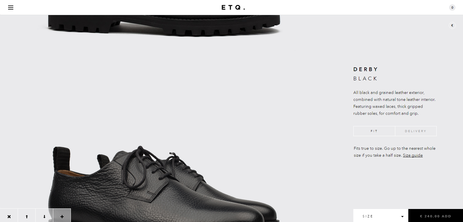
http://www.etq-amsterdam.com/collection/derby-black
Beoplay
- For electronics producers selling products with the use of storytelling is an ingenious solution. It could seem that for typical e-commerce websites this technique wouldn’t work, but if we have a large portion of details about the product trying to present them in a way similar to storytelling is really worth a while. What’s also interesting is the fact that this way of presenting product tabs could also be used in SiS but it would require a higher level of integration with the store.
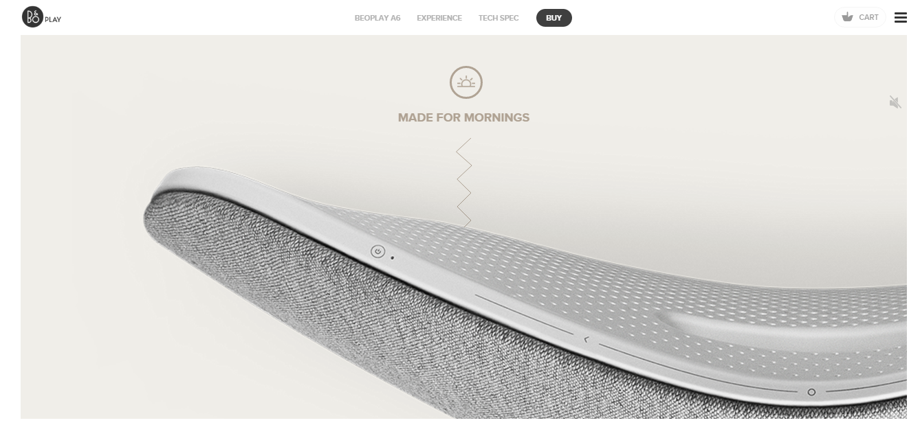
http://www.beoplay.com/products/beoplaya6#MadeForOccasion
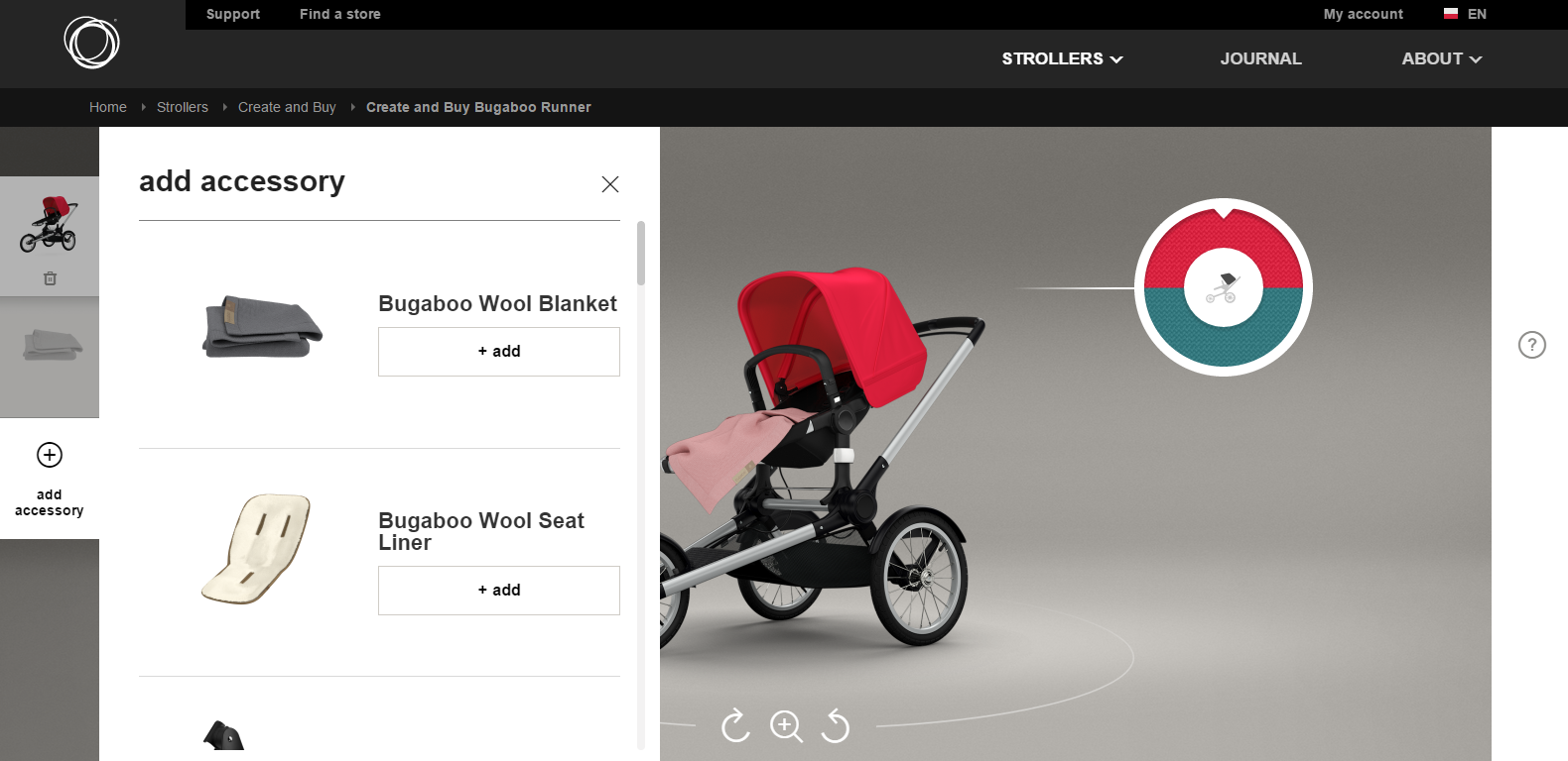
Bugaboo
- Impressive product wizard – if it comes to adding and configuring accessories. What’s surprising is the fact that creating a product is not a problem, but buying it can be – because…there’s no call to action button.
- PS. UXGeeks – check how cool this behaves in respo 😉
https://www.bugaboo.com/PL/en_PL/strollers/create?sId=81&cc=true
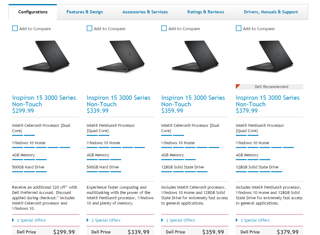
Dell
- If it comes to screens presenting different configurations of the same product we have two ways of presentation at hand: if configuration changes only at the visual level (colour) – we can present different options next to each other, if configuration is differentiated by some parameters – we compare the parameters. And within the second option we found a great presentation by Dell. To facilitate choosing the right criteria which will determine the purchase of a particular product they went for the visual presentation of parameters in levels (blue diagrams at the page below). By means of that users can easily notice that the main difference in pricing lies in choosing a different hard drive.
- The solution used by Dell is not fully optimal because even though the interface facilitates discovering the differences, it doesn’t help in understanding them. The problem lies in terminology used – what does a better hard drive stand for? What is the result here?
- But there’s no doubt that dell.com website is a great benchmark and inspiration in the context of presenting differences between similar products. Once the issue with understanding the criterion is resolved we will have a great user experience adjusted to a wide range of customers.
http://www.dell.com/us/p/inspiron-15-3552-laptop/pd?ref=PD_Family
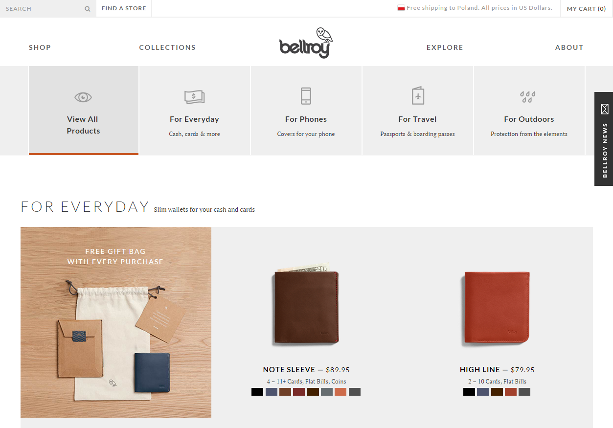
Bellroy
- • Innovative categorisation of products according to their usage (for travel, for everyday, etc.).
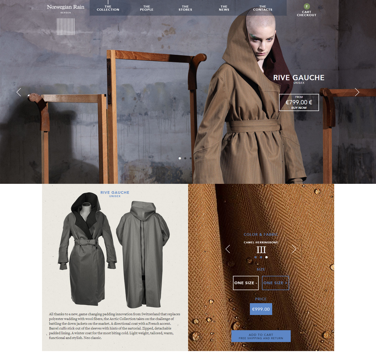
Norwegian Rain
- Large, attractive photos of fabrics (which are particularly important for the fashion market e.g. when a product cannot be seen in the store and is available only online).
http://norwegianrain.com/products/rive-gauche-arctic
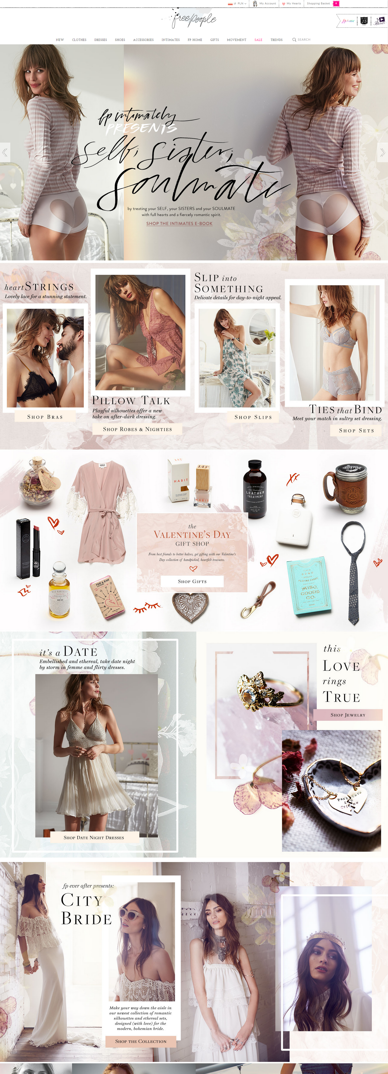
Freepeople
- Beautiful emotional design at landing pages for available product categories. The website seems to be adjusted to the needs of these particular products – intimate, gentle. What’s also important is the fact that this is just a subpage of one product category, not the holistic layout of the website.
- Personalising category subpages or subpages of particular sets largely increases potential for building emotional engagement, shows that we are not generic or bland.
- It’s also worth to pay attention to the non-generic composition which is visible even in the layout of photos – the website which is presenting particular products looks like a beautiful catalogue or a magazine.
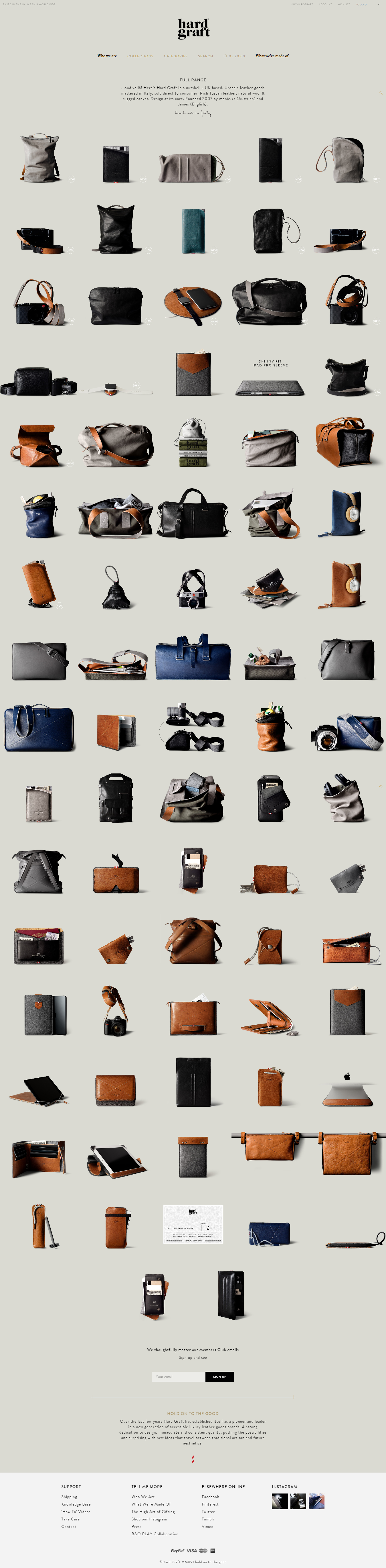
Hardgraft
- Main page displays products in a truly minimalistic, but at the same attractive and subtle way.
BRD
- Great, minimalistic interface presenting only the key information
- Truly polished web design e.g. elegant typography