Websites of the most innovative companies by Fast Company
10 March 2015, Małgorzata TraczykEvery year Fast Company publishes The World’s 50 Most Innovative Company list. The list consists of both major corporations and start-ups that make things ‘differently’, better, faster. Today we want to take a look at websites for some of these companies – in search of inspiration, curiosity, singularity.
So, let’s start:
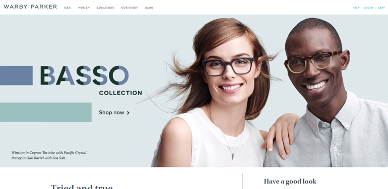
1. Warby Parker– e-commerce
- simple division based on women’s vs men’s glasses and eyewear vs shades
- search filers are not intrusive, although clearly visible and always at hand
- virtual fitting room for products
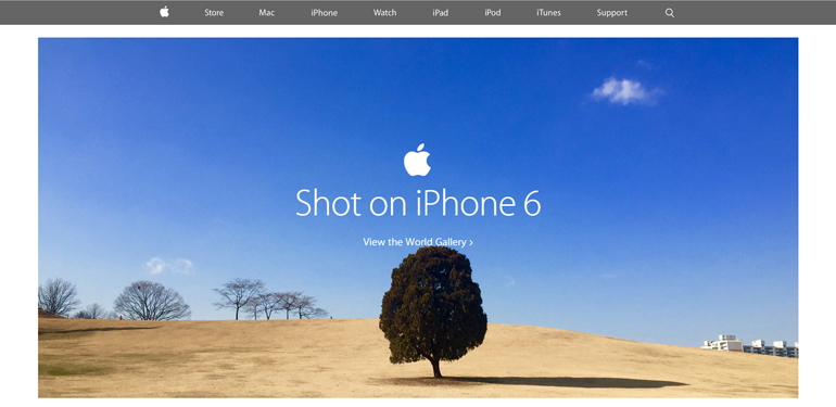
2. Apple – product site
- presenting the product through its users (gallery of photos taken with iPhone6)
- motion design elements that give products the realistic edge
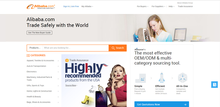
3. Alibaba – e-commerce
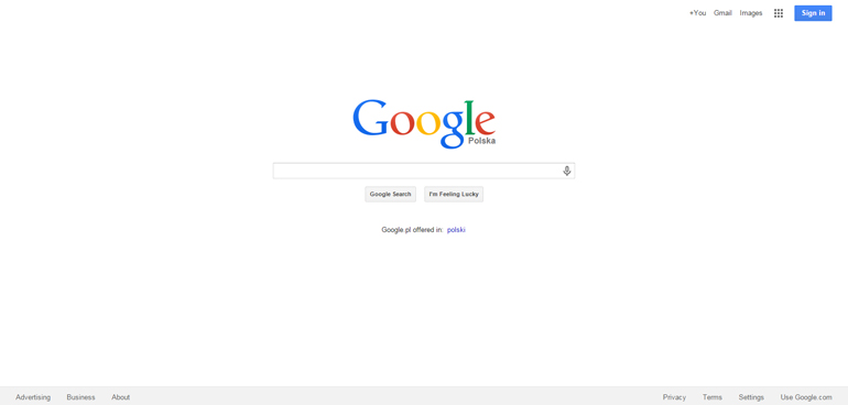
4. Google – search
- simplicity 🙂
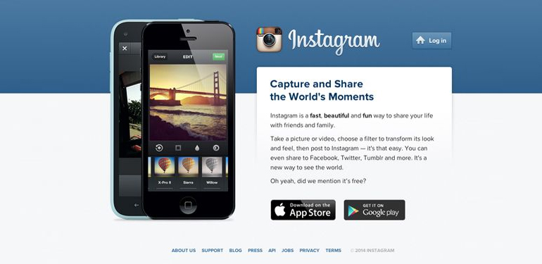
5. Instagram – social media
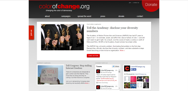
6. ColorOfChange – not-for-profit
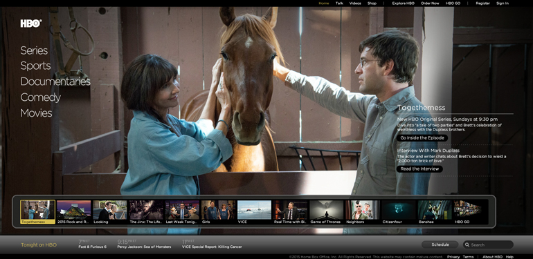
7. HBO – product site
- simple division into film categories
- handy module with the most popular programs and schedule
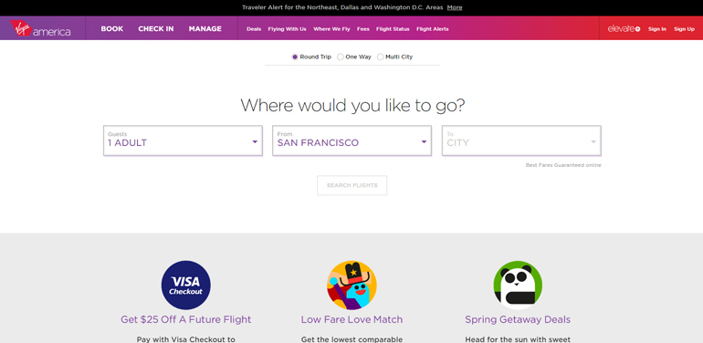
8. Virgin America – e-commerce
- easy search engine consisting of 3 fields
- modern calendar display
- moving away from stock graphics
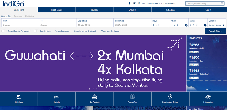
9. IndiGo – e-commerce
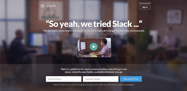
10. Slack – product site
- engaging form of communication – claim that highlights the informal, humane approach to business
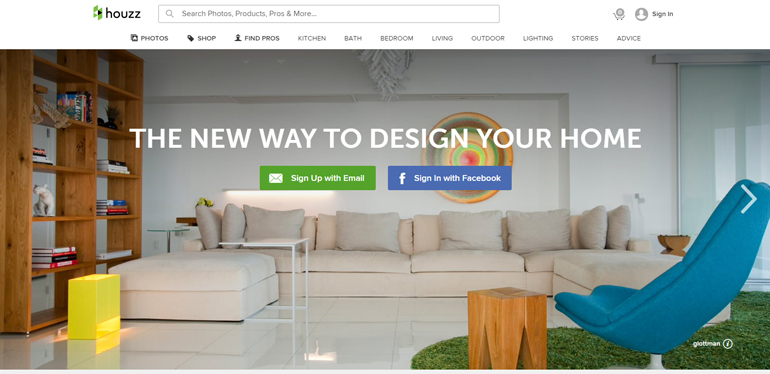
11. Houzz – e-commerce
- large background photo that explicitly presents the subject-matter of the site
- convenient way of browsing through products (using „related products”option)
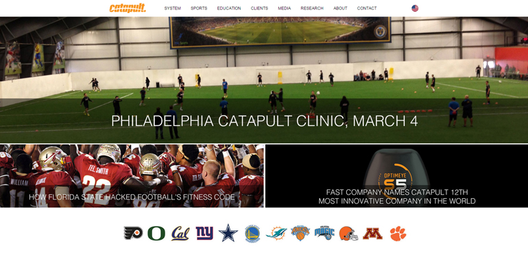
12. Catapult – product site/corporate site
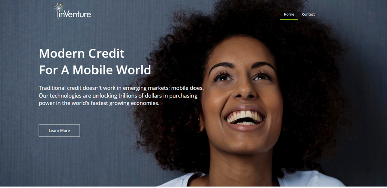
13. InVenture – corporate site
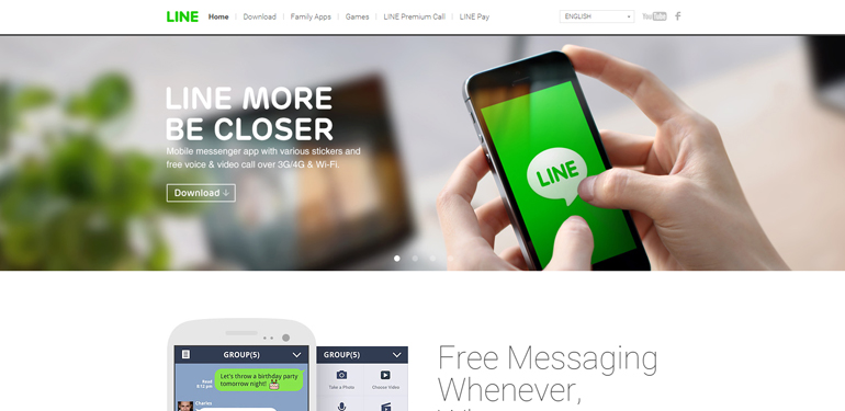
14. Line – product site
- presenting the product through its users
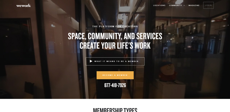
15. WeWork – product site
- video used as a site background, in connection with the claim it explicitly presents the business approach
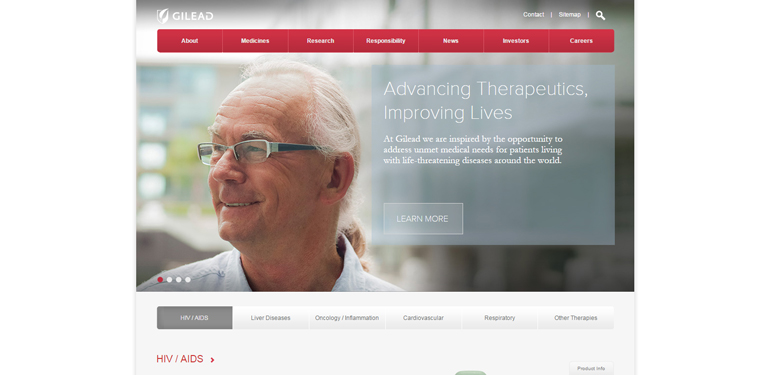
16. Gilead Sciences – corporate site
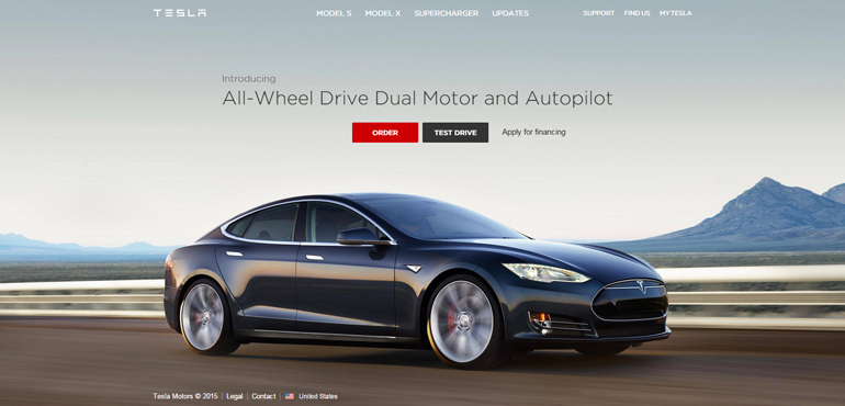
17. Tesla Motors – e-commerce/ product site
- simple division into two main categories – car models overview and test drive
- one of Tesla’s websites Go Electric, is based on the latest ux trend – one pager: large images, animations and presenting the product using storytelling method
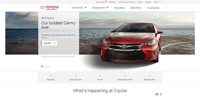
18. Toyota – product site
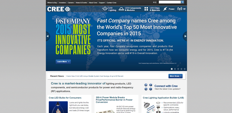
19. Cree – corporate site
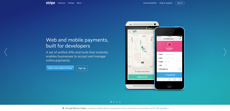
20. Stripe – product site
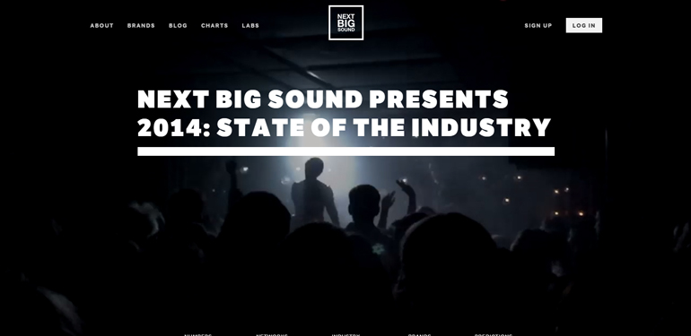
21. Next Big Sound – corporate site
- video used as a site background
- emphasis on typography
- storytelling
- amazing use of animation to present labs
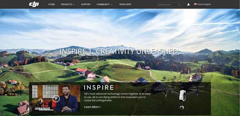
22. DJI – product site/ e-commerce
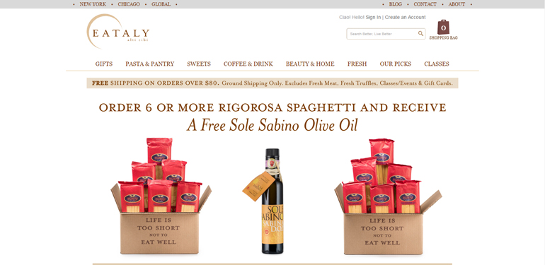
23. Eataly – e-commerce
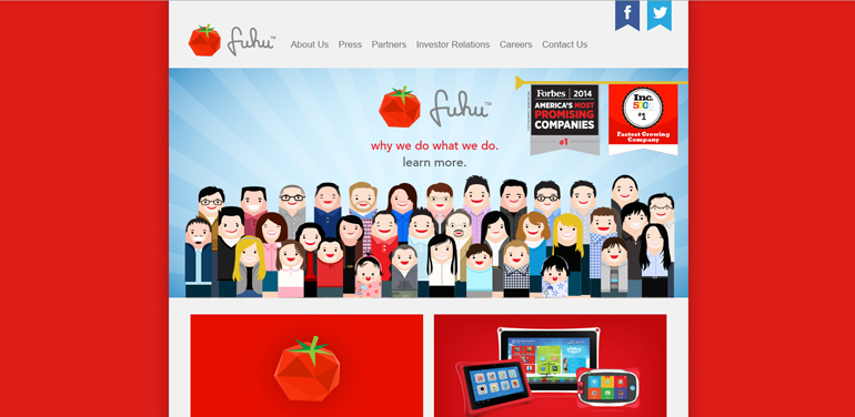
24. Fuhu – corporate site
25. Apricot Forest – product site
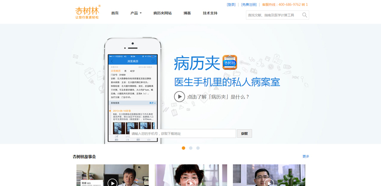
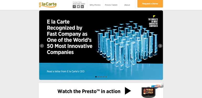
26. E la Carte – product site
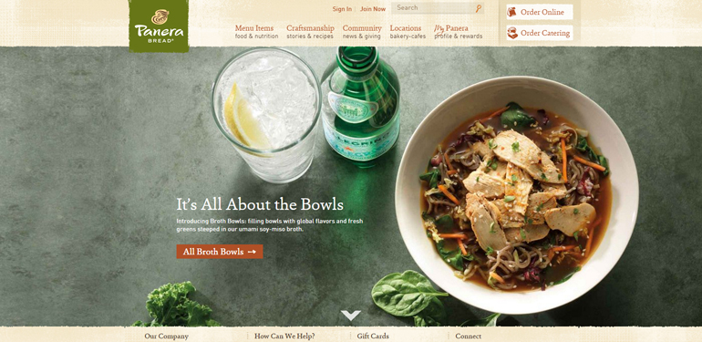
27. Panera Bread – corporate site
- fantastic photos
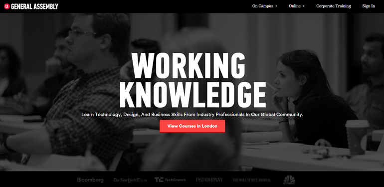
28. General Assembly – corporate site
- emphasis on photos and graphics, moving away from stock images
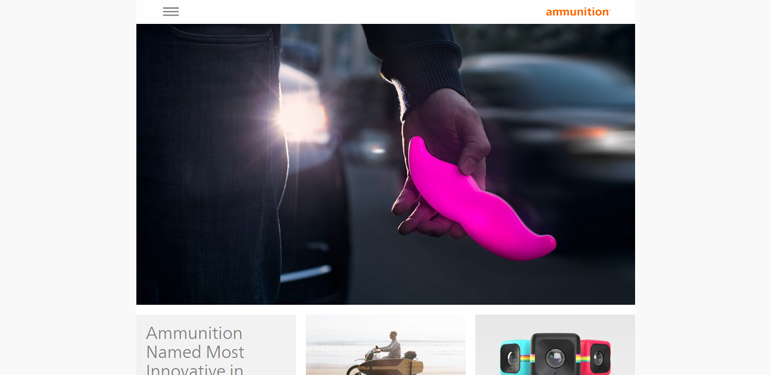
29. Ammunition Group – corporate site
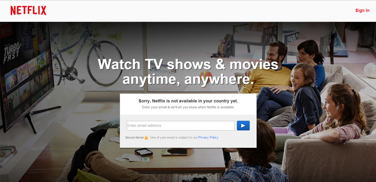
30. Netflix – product site
31. Made In Kigali – coming soon 🙂
- we’ll find out soon 🙂

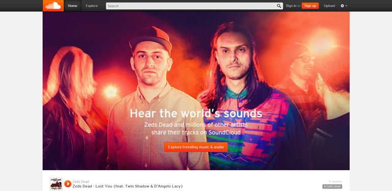
32. Soundcloud – social media
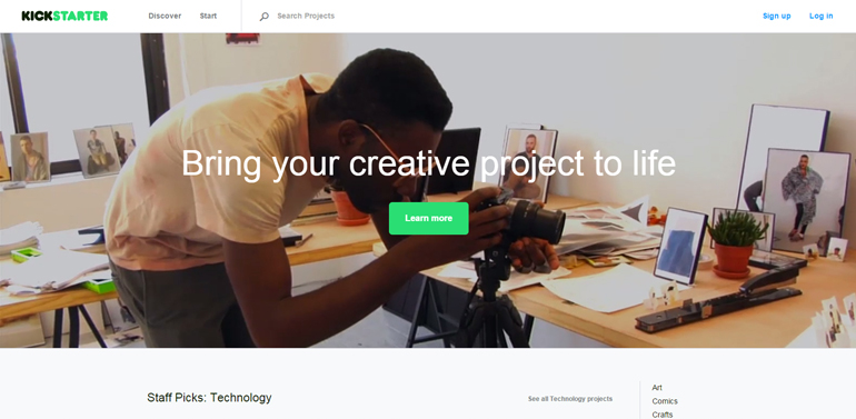
33. Kickstarter – corporate/product site
- video used as a site background
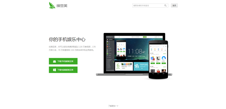
34. Wandoujia – product site
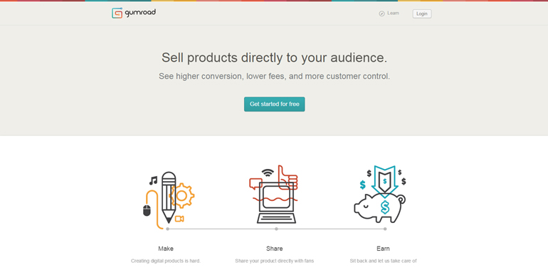
35. Gumroad – product site
- innovative use of animation in the website claim
- moving away from stock graphics
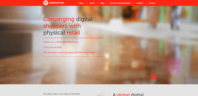
36. Westfield Labs – corporate site
- interesting ideas used in animation
- non-generic way of presenting numerical data
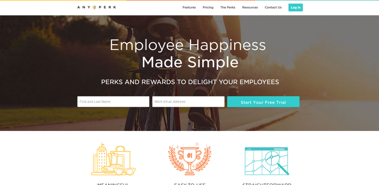
37. AnyPerk – product site
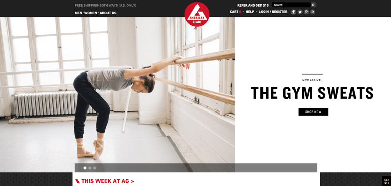
38. American Giant – e-commerce
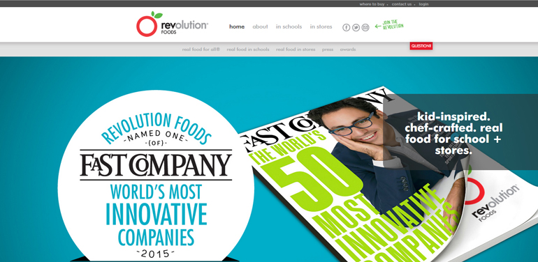
39. Revolution Foods – corporate site
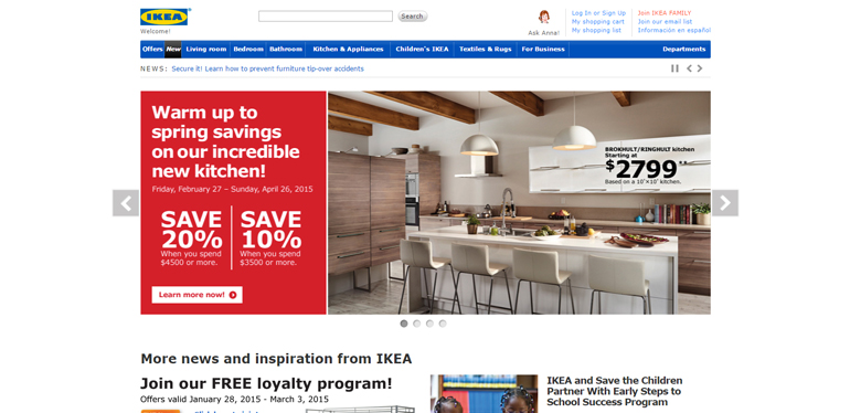
40. Ikea – e-commerce
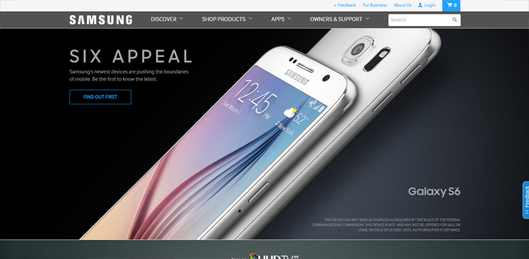
41. Samsung – product site
- animations bring out the edge of products
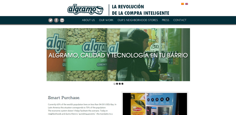
42. Algramo – corporate site
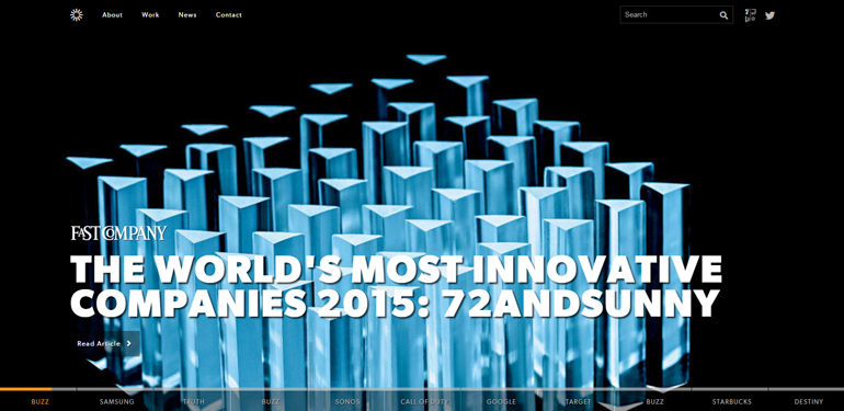
43. 72andSunny – corporate site
- emphasis on typography
- large background image
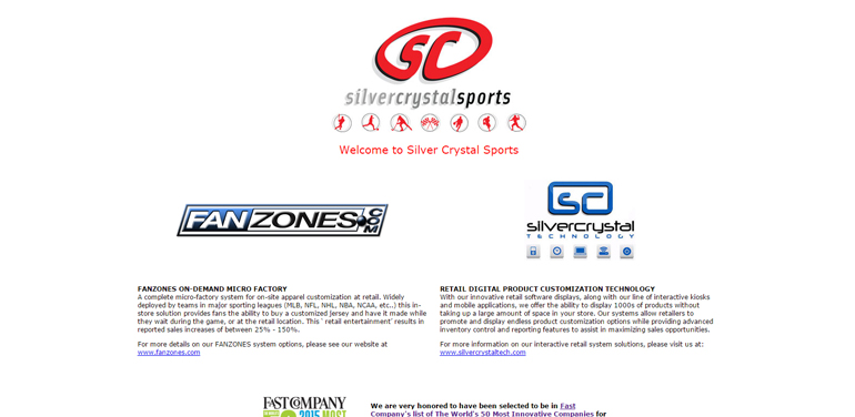
44. Silver Crystal Sports – corporate site
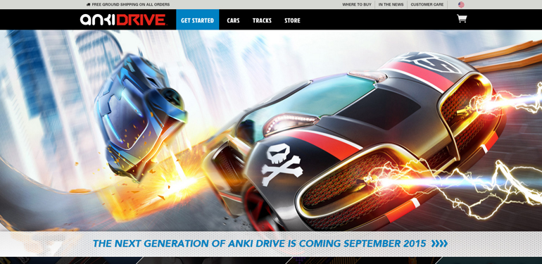
45. Anki – e-commerce
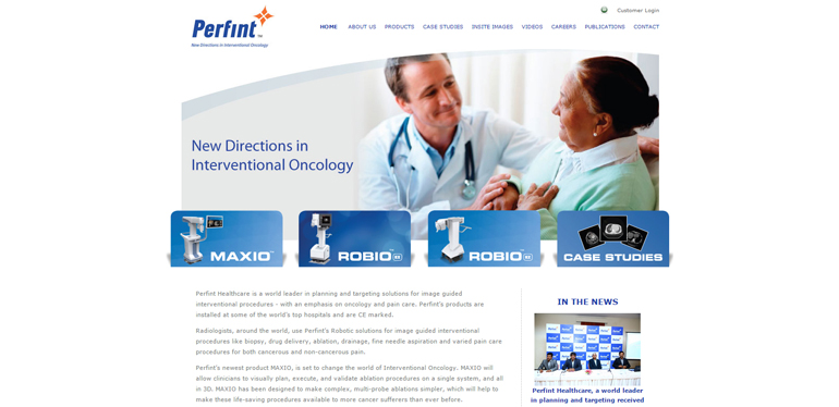
46. Perfint Healthcare – corporate site
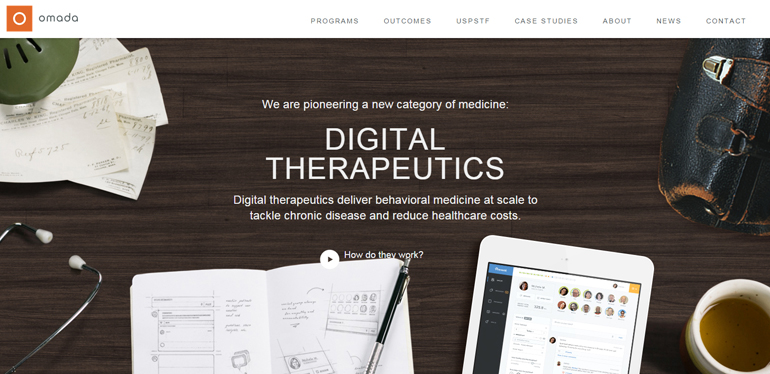
47. Omada Health – corporate site
- emphasis on graphics, moving away from stock images
- non-generic way of presenting numerical data
48. El Mind A – corporate site

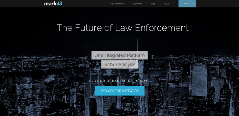
49. Mark43 – product site
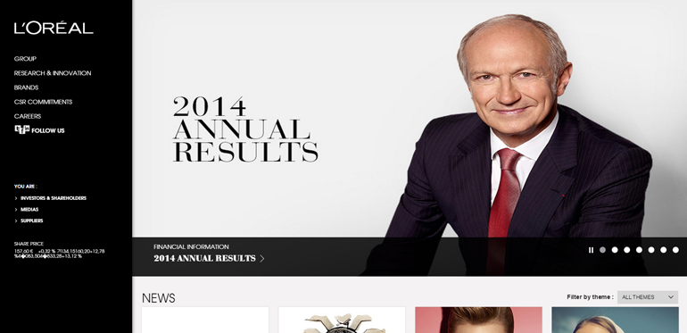
50. L’Oréal – corporate site
Innovation transpires in a variety of ways – by challenging the rules, motivating to action, developing the aspects of life that have been considered as standard, ground-breaking way of perceiving the world. What all these elements have in common is creating the future. Several companies that were included at the Fast Company list present all that also at their websites following the latest design trends.
Summarising the above list we can surely find several joint trends. Minimalism and individual approach to the user reign in 2015. Gradually, the generic style is taken over by personalisation. We can see less and less examples of stock photos at websites and great emphasis is placed on individual creation of icons, graphics and photos. Companies started to highlight pieces of information in customised ways – using videos, large background images, eye-catching typography, interesting data visualisations and animation. More and more often we can see the use of storytelling to present information.
We’re looking forward to seeing new innovations 🙂

