UX Poland 2015 – Experience Everywhere
12 May 2015, Małgorzata TraczykThis year’s edition of UX Poland has just finished. Was it worth to attend? Who showed up? What do we remember? We’ll try to sum up the first day of UX Poland entitled “Experience Showroom”.
Below you’ll find the recap of all main ideas, curious details and everything that stayed in our heads.
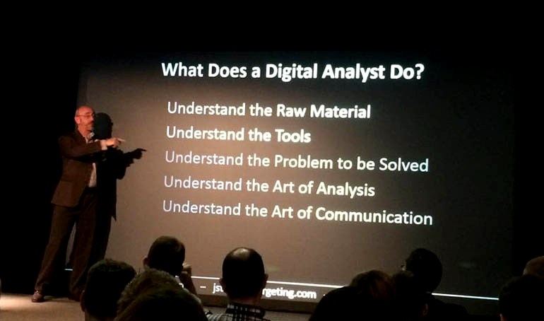
Jim Sterne- AUGMENTING UX WITH DATA
Great speech on Big Data. Big Data is an immense source of knowledge but only if it is analysed properly – by connecting qualitative and quantitative data. Jim has also reminded us that we design for the user not for ourselves. It’s important, because sometimes we can forget about it 🙂
Adrian Iacomi – DESIGNING FOR SURVIVAL – HOW TO DESIGN FOR ONCOLOGY
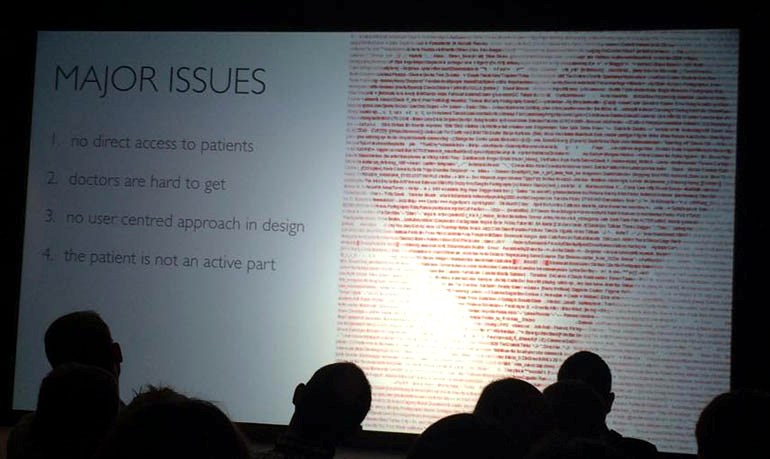
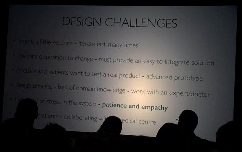
Speech on designing for specific, very demanding group of users – oncology patients. Adrien discussed challenges, problems and lack of the silver bullet for such designs.
Iwona Pomianowska – THE ROLE OF PSYCHOLOGICAL SCIENCE IN SHAPING VISITOR EXPERIENCE – UNDERSTANDING EXHIBITION AUDIENCES, THEIR NEEDS AND BEHAVIOR PATTERNS
The story of museums getting more and more empty and searching for their target audience that is located in a different space then before (online), this why it should be reached in a different way.


Katarzyna Królak – Wyszyńska – LOVE AND MONEY – HOW TO BUILD COMPETITIVE ADVANTAGE ON CUSTOMER EXPERIENCE
Great speech on Experience with capital E.
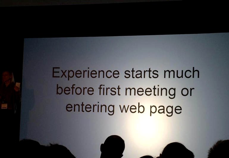
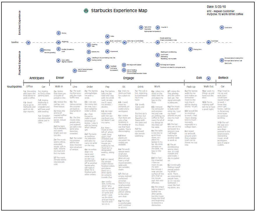
One of the examples of creating positive experience at every brand contact point was Starbucks presented at the map below. Experience built by the brand is well-crafted at every step. It uses innovations like the pre-order app that enables you to order and pay for your coffee at home and pick it up at the coffee house.
Wiesław Kotecki – HOW TO CREATE CONSISTENT EXPERINECE?
The story of building corporate e-banking. Many important keywords appeared during Wiesław’s speech e.g. being ready for flexibility during work and designing rules, guidelines and solutions, not screens 🙂

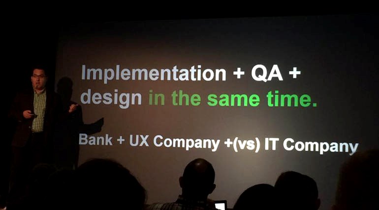
Maciej Płonka – THINGS THAT MANAGER DOES NOT KNOW ABOUT HIS EMPLOYEES, BUT SHOULD
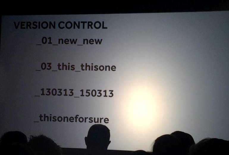
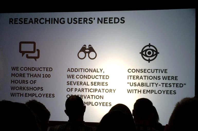
Maciek discussed his observations during workshops with Tauron employees. He presented very accurate conclusions on connecting quantitative data with observing people in their natural context of use. Edisonda spent over 100 hours with company’s employees which gave them a chance to notice innovative solutions used at work. Some of these were presented at the photo below 🙂
Subsequent versions of file names
Edisonda research process
Monika Mikowska- SKYCASH MOBILE APP REDESIGN
– WHY MICROINTERACTIONS ARE SO IMPORTANT IN MOBILE UX?
The summary of this presentation can be one word – Microinteractions. These are the moments when we reach for our phone to satisfy some need e.g. switching off an alarm clock. We should pay special attention to these moments during the design process. During her speech Monika discussed several cool apps like Checky – to check how many times during a day we unlock our phone (eg. Monika scored 56) and Umbrella – an app informing you when you should take an umbrella. The latter is an example of the upcoming trend “Future of apps in no apps” according to which the best and most useful apps can be “invisible”. Their essence lies in experience itself, looking at the example above – when it’ll rain you’ll see a message, if it’s sunny – the app is asleep. Cool idea to be considered by other start-ups 🙂

Monika has also showed several very interesting examples of designs where small details were forgotten.
Lack of ‘Forgot your password’ button at Allegro.

Error message – one of the most incomprehensible for users 🙂

More on microinteractions can be found in Monika’s article – Mikrointerakcje w mobile UX.
We also encourage to checking out her blog – Jestem Mobi.
PS. Monika – great heels 🙂
Adam Plona- HOW WE BUILT THE BIGGEST HOMEPAGE IN POLAND? (WP.PL CASE STUDY)
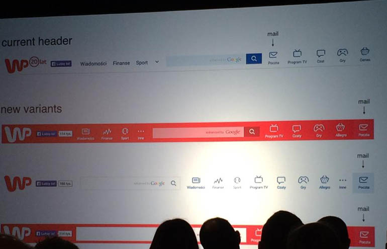
Very brave and inspiring speech on changes at Wirtualna Polska homepage. Projection studies conducted for wp.pl showed that the site is associated with oldschool and outdated design. Wirtualna Polska team implemented the design for the new version of the site in 2 months which was a true hackaton. But the fun started even later on. One of the curious discoveries was that the users of wp.pl click in the same space habitually regardless of what is actually located there: mail, tv program or news.
During his speech Adam said a very important thing – We should always question our thesis and search for answers. 100% agreed by us 🙂
Agnieszka Osytek – MIGAM – WE MAKE A CONNECTION BETWEEN TWO WORLDS
The success story of Migam which aims at effective communication. What’s interesting, Agnieszka has also described how joining the team by the hearing and speech impaired person changed the perspective of the company. As you can see Designer is a Designer but it’s worth to go outside the box sometimes 🙂

Karl Gills- HOW TO CREATE BETTER A/B TESTS BASED ON USER RESEARCH
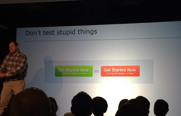
Absolutely fantastic speech. Not only if it comes to the presented content, but also the form of presentation. Not many people can discuss such challenging subjects in such an innovative way. The main conclusion from this speech – designs should be approached with consideration. For example if users don’t see a call to action they will not click on the button. Simple and logical 🙂
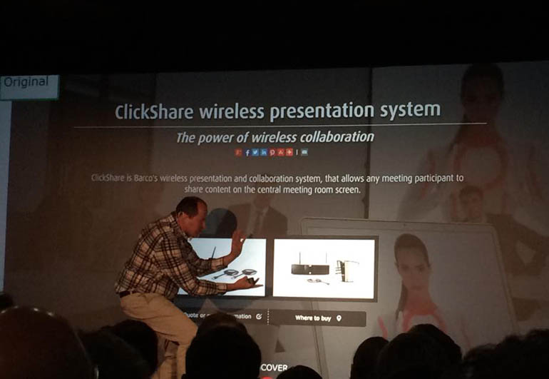
Full presentation below:
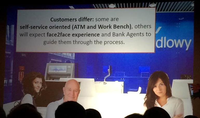
Paweł Stężycki, Małgorzata Wyczańska- BRINGING DIGITAL TO F2F EXPERIENCE, CITI SMART BRANCH ECOSYSTEM
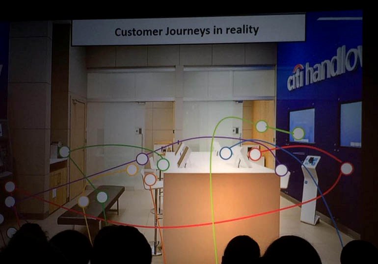
Gosia and Paweł discussed joining the offline and online channels. Their conclusions included an interesting comparison of customer journey in the bank branch – every potential Customer walked around the branch differently than it was expected. It’s of course not new that first expectations are verified in reality, but take a look at photos below to see the changes that were observed in Citi 🙂
Expectations
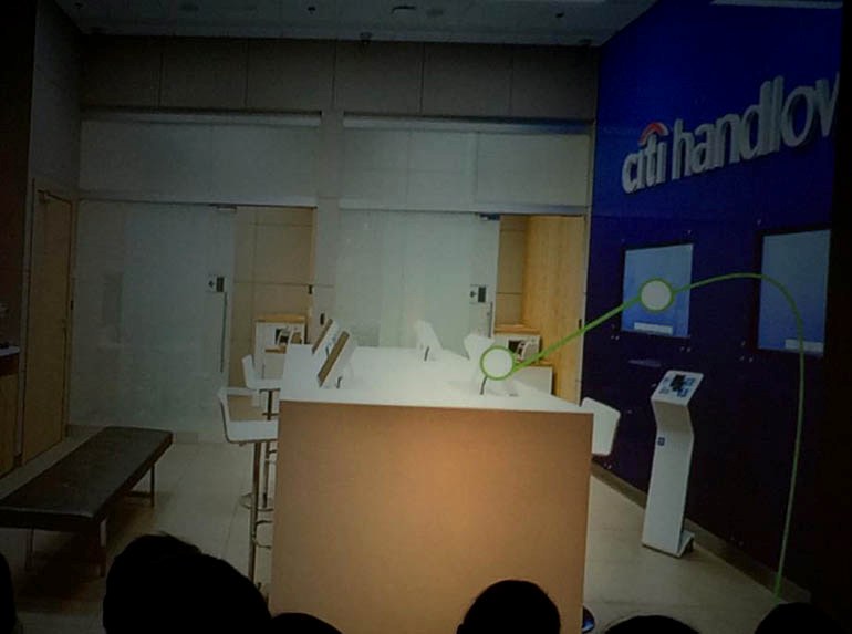
Reality
Marcin Ukleja- VYBE. REAL WORLD – REAL TIME
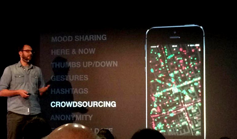
Great idea for an app. Vybe aims at showing emotions on a map. Users anonymously tag their moods and add hashtags thanks to which others can check e.g. where you can eat good lunch right now. We suspect that street traffic could also be tested 🙂 The app is currently crowdsourcing to start, we keep our fingers crossed and we’ll definitely use it!
Jakub Krzych- NEW INTERFACE IS NO INTERFACE: HOW CONTEXT AND PHYSICAL WORLD ARE CHANGING THE USER EXPERIENCE
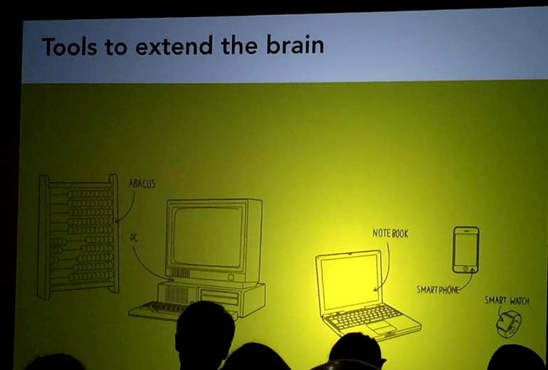
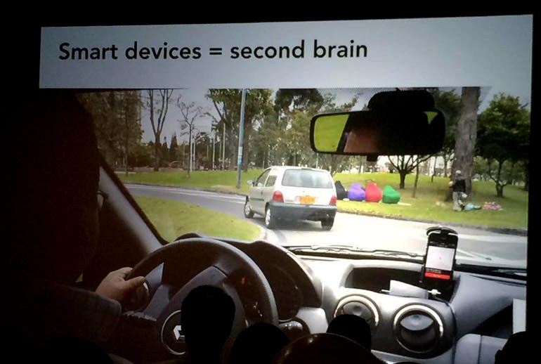
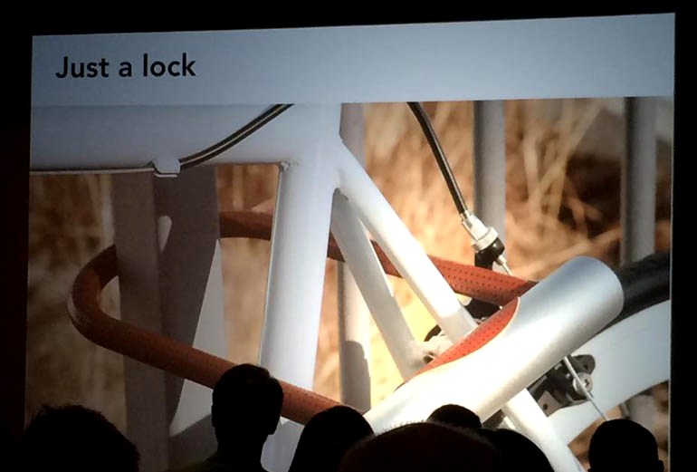
Kuba discussed how our “second brain” embedded in apps sometimes becomes our first brain. An example here can be a gps in cars – we don’t think about the best route to take any more we follow what the device is suggesting. During his speech Kuba has also presented a perfect example of user experience – a bicycle lock that opens when the owner approaches his or her bike (designed by Noke). We think that it will be the next big thing and if the co-creator of Estimote says that, there has to be something to it 🙂
Itamar Medeiros- LOOK, LISTEN AND (MAYBE) SPEAK: REFLECTION-IN-ACTION FOR WORK AND FOR LIFE
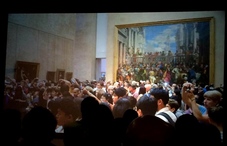
Very good speech on listening, empathy and the ability to observe and be aware of cultural differences. Take a look at a great example of the current way of experiencing (photo below).
Tourists in Louvre not focusing on experience or being in contact with the art, but on proving that they were there by taking photos…
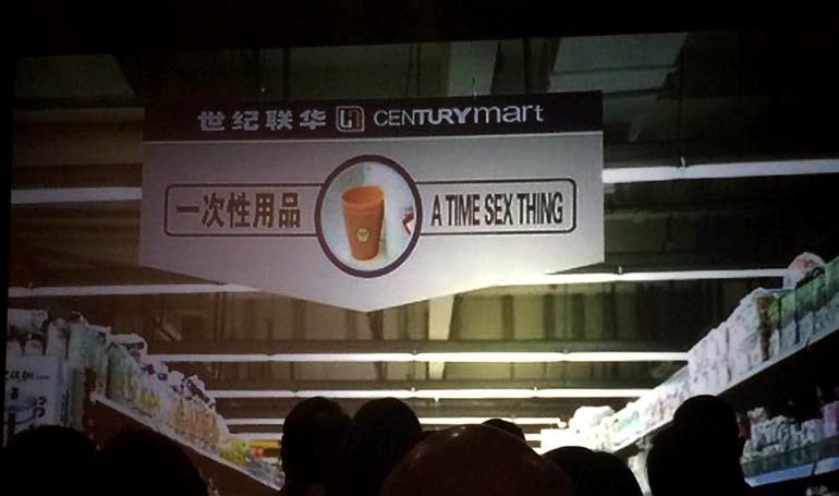
Moreover, some signs that mess with our mind 🙂
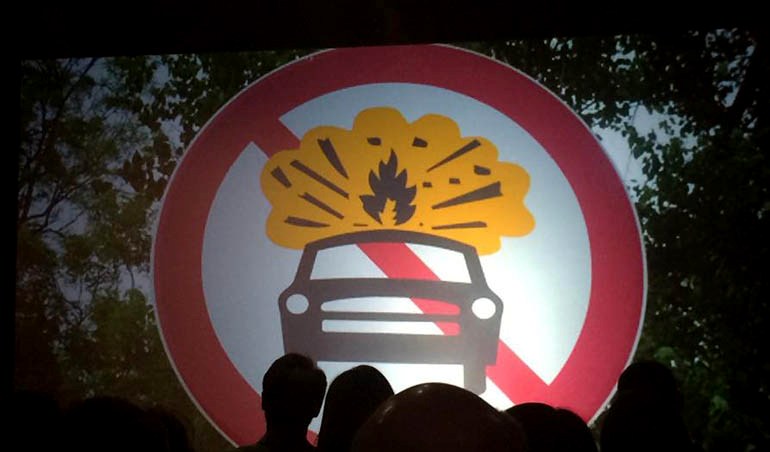
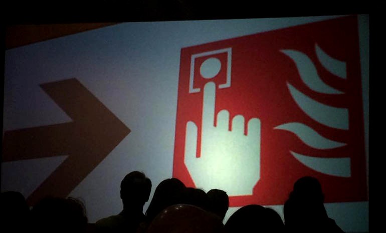
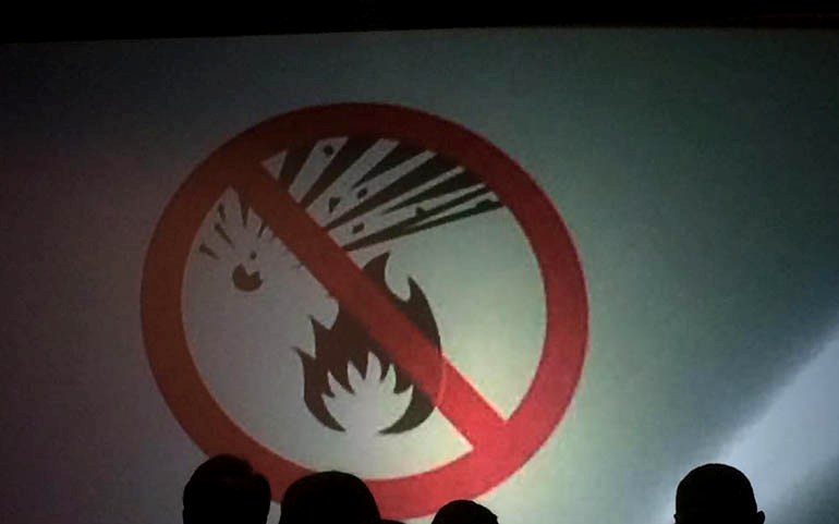
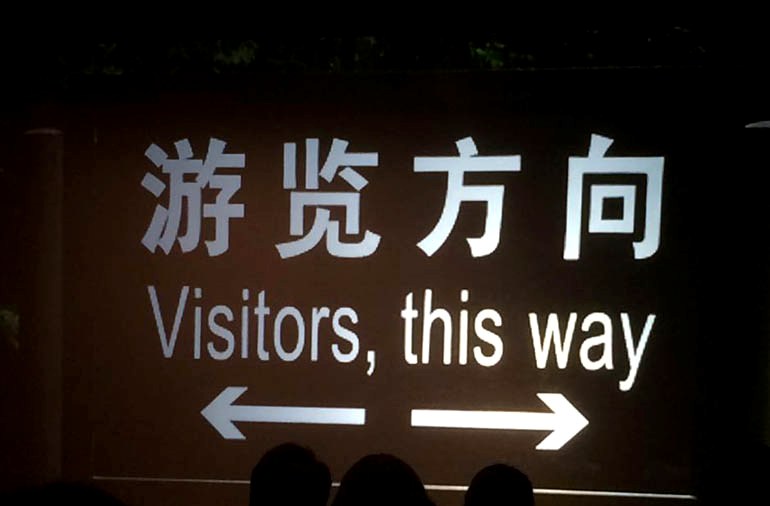
Lisa Marshall – INNOVATING IN THE RIGHT DIRECTION
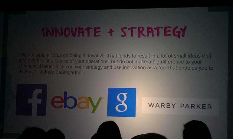
Lisa discussed Zappos company culture – happy employees with passion. During her speech she highlighted the approach to innovation – focusing on company’s strategy and treating innovation as a tool to succeed.
UX Poland, thank you for this Experience 🙂
PS. UX Poland – great idea with a cloakroom without a cloakroom assistant 🙂


